Imagine this scenario. The designer and the client both have a vision in their mind of the next print piece.
It is sleek.
It’s impactful.
It’s focused and effective.
The strategy meeting takes place. We’re all on board. Mood board is approved. Outline is polished. We’re ready to get started.
You send your content over to your designer and WOAH.
Hold up.
There is a huge disconnect between the vision and the reality. Suddenly your sleek print piece is crammed full of content that no potential donor is ever going to get through. There’s no longer space for the infographic you planned. Those photos? Out. The restful white space? Gone!
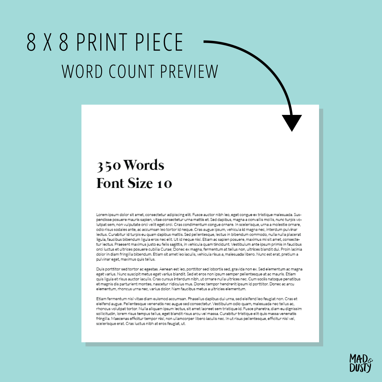
A small trick to avoiding this? Ask your designer for a look at what different word counts look like on the size piece you’re creating. This small step can save you time and make your piece more effective in the long run.
Here’s an example of a word count preview we created for Goshen Valley. This was made when we started working with them and has informed all their print pieces since.
Gathering, writing and editing the content for your project can be difficult. The word count previe will give you an idea of how much content your need for each point on your outline. If you come to a paragraph that just can’t get any shorter, no problem. You and the designer both know it may be a tight squeeze. You can consider options like adjusting some of the other pages or even adding pages.
If you’d like to talk about your print marketing, let’s chat!


