Recent Work

Brand and Packaging Design for Etsy Maker Ordinary Mommy

branding-design-ordinary-mommy.jpg

Dusty and I are using our COVID-19 Quarantine to feature some projects we never got the chance to share. (Cobbler’s kids are the last to get shoes and graphic designer’s sites are the last to get updates. Eek!) This project was completed in 2017. It is such a great blend of our styles. Dusty’s clean, orderly aesthetic and my painterly approach.

Dusty and I had to opportunity to collaborate on this brand, Ordinary Mommy. What a dream! Our client, Faith Lex already had a brand style in place, but she needed something a little fresher.

Faith creates custom handmade decor for the modern bohemian home. When ever we hear modern, we think of good, clean design and packaging. (Those details can help justify higher prices.) Her products are top notch quality, and this new logo helped make that apparent at first glance. 

Here’s a bit about the branding process:

All of our branding projects begin with a mood board. It’s a great way to establish the overall tone for the logo and brand. Faith’s mood board is light and airy, modern boho with natural elements.

Ordinary-Mommy-Mood-Board-Preview-1.png

After the mood board is finalized, we create three logo concepts for the client.

Ordinary-Mommy-Logo-Concepts-Preview-1_Page_05.png
Ordinary-Mommy-Logo-Concepts-Preview-1_Page_07.png
Ordinary-Mommy-Logo-Concepts-Preview-1_Page_09.png

The client is asked to pick one concept to move forward with. We incorporate feedback and go to Logo Revisions Round 1. In this project, Faith went with Concept 2.

Ordinary-Mommy-Logo-Concepts-Preview-2_Page_4.png
Ordinary-Mommy-Logo-Concepts-Preview-2_Page_5.png

Then we work on another round of revisions, add color and arrive at our final logo.

Watercolor-med.png

At the end of the project, we create a brand guide book and export the logo variations (black, white, color, watercolor, and brand mark) in various easy to use formats. The brand guide book will help our client use the logo and branding effectively. It’s also a great resource for Faith if she should ever work with another creative like a product photographer or hire on employees. The guide book can help maintain the brand’s cohesiveness. If you’d like to take a look at an example brand guide, send us a message!

2018 Mad & Dusty Logo Round Up

2018-Logo-Roundup-Blog.jpg

For the billionth time, I’ll say it “How is it 2019?!” Like every year, there were ups and downs. All in all, I’m looking back on 2018 pretty fondly. (I mean, 2018 is the year we became pregnant with our sweet twins. Finally getting those interns I’ve been needing!)

2018 was a fun year for logos here in the studio. We worked with makers, small businesses, solopreneurs and nonprofits. One thing they all had in common - each of these folks is making the world a better and more hopeful place through their work. Dusty and I are beyond honored to be a part of their story. Here’s a look back at the logos we created in 2018:

Chatterbomb Logo Design

ChatterBomb

ChatterBomb is a clothing company that celebrates encouragement and community. Jessica’s punchy shirts feature a message on the inside, close to the heart where it matters most. Her logo has a vintage flare and bold presence to match the brand’s personality.

Lead Designer: Dusty Beaulieu

Full Project Scope: The Brand Workshop with apparel design, print + packaging design, and styled photo shoot

Little Moon Rising Logo Design

Little Moon Rising

Becca is a childbirth educator and natural remedy maker. (Her Elderberry Syrup will banish any cough or cold.) She launched Little Moon Rising as a place where germs aren’t scary, women are empowered, and the food is good. Her logo was inspired by old time apothecaries and their imperfect, organic typefaces.

Lead Designer: Madison Beaulieu

Full Project Scope: logo design, packaging design

Chantel Adams Logo Design

Chantel Adams

Chantel Adams helps inspired women follow their mission, not the madness. She creates content and products. (Her free guides are amazing!) Her logo is playful, grounded and feminine and aligns with her brand’s core values.

Lead Designer: Madison Beaulieu

Full Project Scope: The Brand Workshop

Susie Mann Logo Design

Susie Mann

Susie is a New York photographer. While she photographs a wide range of subjects, this logo was developed specifically for her family shoots. Her logo’s fun and lighthearted feel mirrors Susie’s magic ability to make anyone smile and feel at ease.

Lead Designer: Madison Beaulieu

Full Project Scope: logo design

Broadview Logo Design

Broadview Brand Strategy

Bethany launched her consulting firm, Broadview to help small businesses come up with a marketing strategy that communicates with customers in a way that connects. (Psst, She does free consults!!) As small business owners, we’re often too focused on the details of our business to know how to communicate our story to customers. Her logo is a nod to that old saying “Can’t see the forest for the trees.”

Lead Designer: Dusty Beaulieu

Full Project Scope: logo design

The Busy Bead Logo Design

The Busy Bead

Emma Kenney, a retired NICU nurse, created The Busy Bead out of her love for making and desire to share. She creates nature inspired jewelry with gems and stones designed to heal. Her logo is a cute and playful take on the name. (I have this bracelet and I wear it all the time!)

Lead Designer: Madison Beaulieu

Full Project Scope: logo design, packaging design, Etsy shop launch

Miles4Major Branding Design

Miles for Major

Miles4Major is a non-profit organization that aims to raise awareness and financial support for families of hearing impaired children through family-centered outreach events such as the Annual Miles-4-Major 5K Race. Miles4Majors help families go one more mile. This logo is made to grow with the organization and fit as needed.

Lead Designer: Dusty Beaulieu

Full Project Scope: logo design, website design

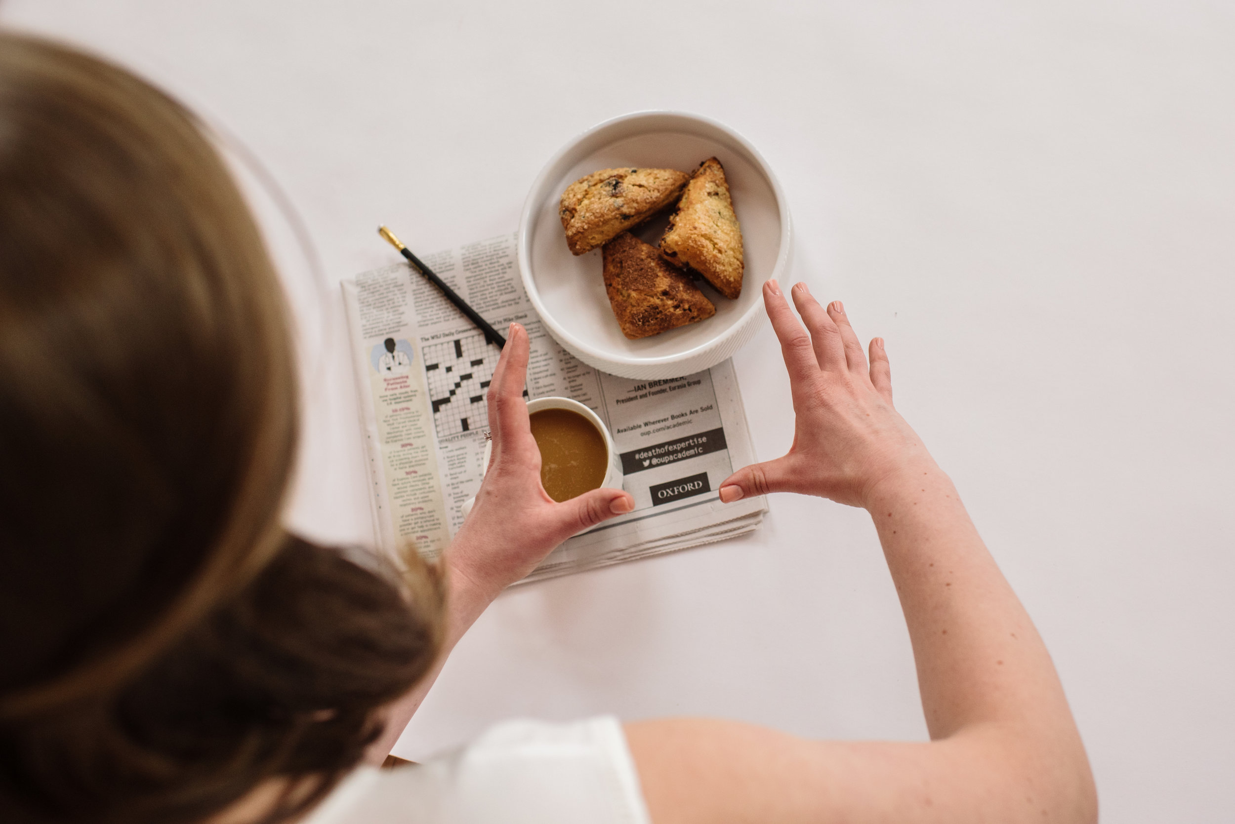
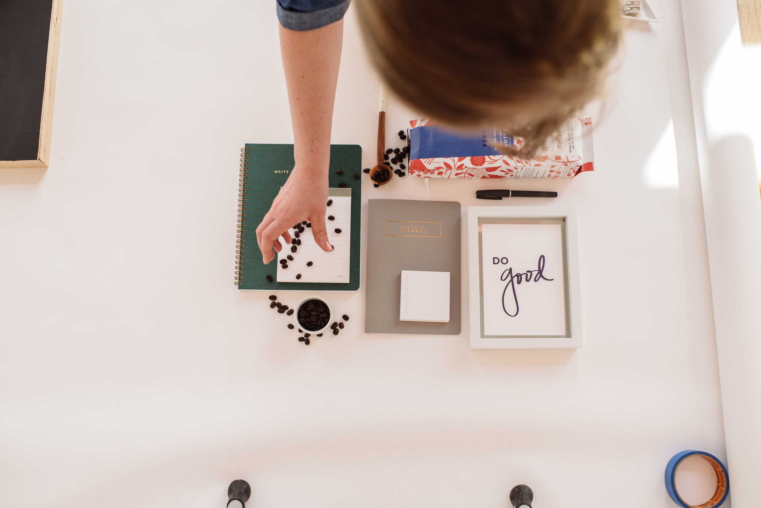
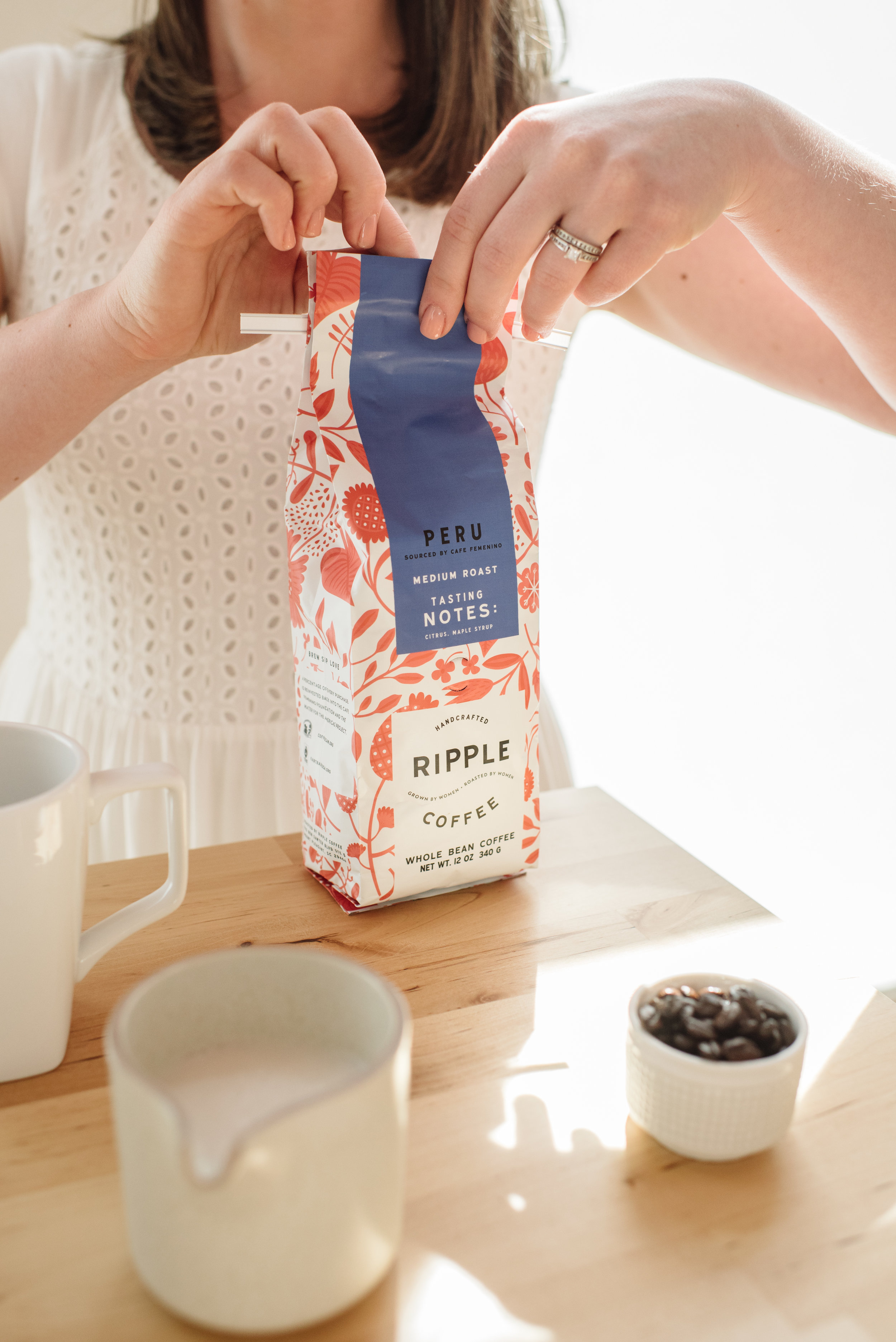
Behind the Scenes: A Styled Shoot for Marie Mae Co

Styled shoots have been one of my favorite projects lately. I love talking through the product and brand story with the client. Finding props, and then making shot lists and story boards - it's this magical combination of planning and treasure hunting.

For this shoot with Marie Mae Co., I teamed up with the lovely Angie Webb. She took care of photos and lighting, which allowed me to be all in when it came to styling. We had 4-5 major "scenes" for this shoot and about 10 products all together. 

marie_mae-102.jpg

We shot the entire session at Ember Hot Yoga in Downtown Woodstock. Amazing natural light and white walls made for photo shoot heaven. 

One under appreciated skill is how to drop things beautifully. I think it's something I learned in art school. Styling photos is so similar to painting - laying out the composition, considering colors - it's all there.

Product photos have to tell the story for customers who are too busy to read your product descriptions (i.e. everyone). Like most visuals, product photos work as the receptionist. Good photography is like a warm welcome to your audience. It should say, "You're in the right place. This is for you."

Hope you enjoyed this behind the scenes peek! You can see the final pieces on this page. If you're interested in a photo shoot for your company, don't hesitate to reach out. Contact us to get a list of current rates in your inbox.

Hugs!
Madison